
by Shirley Hailstock
Since there have been so many blogs on Christmas, I decided to do something different. So let's get to it...
We all do it. We judge a book by its cover. Since most of the bookstores closed where we used to browse the shelves of life-size images, we now see cover after cover online and choose what we want to click on and read.
So I was playing around with Photoshop CC (Creative Cloud). I should be writing, reading a book I promised to provide a quote for, or icing those cupcakes that I have to take to school tomorrow. Instead I'm creating book covers.
I thought I'd share some of my fun with you. Many readers ask authors about the covers that appear on their releases. I'm not a professional and the process will be the basics, but you'll get the gist.
It's a good thing if you have an idea of what you want the cover to look like. I have books set in Washington, DC, so I began there. And additionally, I thought of the color I wanted the background to be. I experimented with several covers.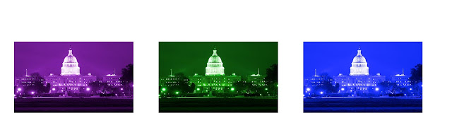
And decided on this one.

In the foreground, you can see that the grass is very dark. What you can't see is the reflection of the Capitol in the water that's in the front of the building. So through the magic of Photoshop, I added it.

Notice the color changed a little. That's because I have a background behind the entire scene that is not visible. It's white and changes the color a little. I liked the change, so I kept it. The reflection is also clearly visible.
Now, I have to add people, mainly because I like to see the people who are in the story. The couple I chose are clearly on a beach.


Since there have been so many blogs on Christmas, I decided to do something different. So let's get to it...
We all do it. We judge a book by its cover. Since most of the bookstores closed where we used to browse the shelves of life-size images, we now see cover after cover online and choose what we want to click on and read.
So I was playing around with Photoshop CC (Creative Cloud). I should be writing, reading a book I promised to provide a quote for, or icing those cupcakes that I have to take to school tomorrow. Instead I'm creating book covers.
I thought I'd share some of my fun with you. Many readers ask authors about the covers that appear on their releases. I'm not a professional and the process will be the basics, but you'll get the gist.
It's a good thing if you have an idea of what you want the cover to look like. I have books set in Washington, DC, so I began there. And additionally, I thought of the color I wanted the background to be. I experimented with several covers.

And decided on this one.

In the foreground, you can see that the grass is very dark. What you can't see is the reflection of the Capitol in the water that's in the front of the building. So through the magic of Photoshop, I added it.

Now, I have to add people, mainly because I like to see the people who are in the story. The couple I chose are clearly on a beach.

There's no beach in my story, so I cut it away and only left them.

Now it's a matter of combining the two images. Each image is its own story, so I needed to blend them.

Initially, when you put the two images together, you can't see through them. Using a blending technique, I expose part of the couple in the background.
The photo comes out looking like this.

Now, it's time for the text. The fonts for the author's name remains constant on all their books if the publisher chooses to do that. On self-published books, the author generally chooses a font she likes and uses it as part of her brand. I chose the font Anastasia for my name.

The font used for the title presents another area that needs to be addressed. Not only the font itself, but the color(s) needs to blend with the other colors and the words need to be clear enough to see, especially as a thumbnail (very small image). Notice that my name is huge on the cover. That's a branding technique. The author's name will remain the same (exceptions are not addressed here) while book titles will change. And we want readers to remember our names.
That's just about it. Since this is a December blog, I hung a candy cane on the title. Using another method I painted out (not the technical term) part of the candy cane image so it appears to hang from the letter T in The.
As I said, this is very rudimentary. The process can take many more images. I used 8 here, including the text which is also an image. Each word is separate, allowing me to place them where I want them or move them around to see if it looks better.
Finally, we get to the point where the cover is done. It relays the story at a glance. This cover would say the book is a contemporary romance, set in Washington, DC with a light plot. You wouldn't expect to find a dark paranormal or a dark suspense from the makeup and title of the cover.
As a note, I do not have a book called The Promise. I used it to demonstrate the color and fonts that complement the total artwork. All the images used were either free for use or I purchased the intellectual property.
So next time, you browse or look at an author's cover, you can see that there's branding and communications through the images and fonts.
Happy reading...
Shirley, such a cool post! I've never made a cover so seeing this part of the process was interesting!!
ReplyDeleteInteresting. Thanks for explaining. I never gave the cover that much thought!
ReplyDeleteAs Rula said, very cool! Love the idea of how a single choice can totally change the look.
ReplyDeleteVery interesting Shirley and you clearly have many talents other than writing! Does your knowledge about cover production influence your in-put into your own novel cover designs? I envy this ability to envision how a cover might look. Would be helpful when we have to complete the ARS sheets!
ReplyDeleteYes, it absolutely influences it. I give the designer a lot of details about the story and the background, but she does all the work. I haven't had one yet that I said no to. My vision and hers seem to mesh.
DeleteYou are so clever. I'm really impressed as I'm so helpless when it comes to even adding clip art to my blogs. Sigh. It would be a good title and cover for one of your books.
ReplyDeleteInteresting. The end result was great.
ReplyDeleteA nice cover really inspires me, that’s why I love paperback books so much. I can keep looking at the cover. And Heartwarming covers are almost always ones I want to keep taking a glance at. I use many as the background on my iphone and iPad. Thanks for posting.
My wallpaper on my computer changes all the time. And whenever I take a photo on my phone that I love, I make it my background too.
DeleteLove it, especially the candy cane haning on the word. You are a woman of many talents.
ReplyDeleteI try.
DeleteI enjoyed the process and the photo choice you started with. Very clever way you made the people and background work in harmony. I enjoyed this a lot.
ReplyDeleteThanks. I saw so many covers using this technique that I had to learn it and after that there were so many "windows" that opened.
DeleteWay interesting!
ReplyDeleteShirley, thank you for the behind-the-scenes tour of creating your book cover! Wow! I love the Anastasia font that you chose and the final product came out looking spectacular! The candy cane is such a cute touch, too.
ReplyDeleteHappy Holidays! :-)
The candy cane was a December touch. When you see a cover where the letters loop over each other, they are using that technique.
Delete